 Design inconsistencies I found in the backoffice
This project presented a unique challenge in which I had to organize and standardize the design elements of Mantel’s own system called the backoffice. This project was to ensure that the design remained consistent across different platforms and user interfaces, providing users with a cohesive experience.
The goal was to create a unified, scalable design language that could be applied to future design projects and existing systems, making it easier for designers to develop new features and functionality.
I started by conducting a system analysis and compiled a list of three key aspects:
I presented these lists to the Product Owner and Medior UX Designer and together we identified which components should be included in the Design System and which ones were one-time exceptions. These exceptions are unavoidable in a system that covers so many different aspects of Mantel. It’s bound to happen that a unique feature needs to be made that wouldn’t serve a purpose somewhere else.
Design inconsistencies I found in the backoffice
To maintain an organized and comprehensive overview of all components in the system, I created a component library in Figma. This library was structured in such a way that functional prototypes could be created quickly through the use of components and nested components.
For instance, I compiled a list of all icons used in the system and assigned meaning to each one, based on the existing use of those icons. This ensured clear guidelines, like which ones should be clickable, how they should be placed, and what the colors represent.
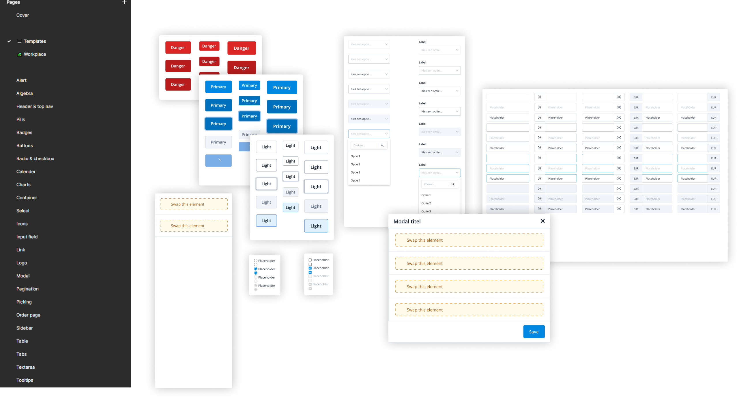 An example of components present in the design system
A component that frequently appears in the system are tables. Every table is unique, which makes it challenging to create a standard component. During the design process, I found myself frequently rebuilding tables from scratch, which was really time-consuming. To address this issue I compiled a list of every possible addition and unique feature found in every table in the backoffice. I then combined these features to create a modular table component that can be customized through properties to take on any desired form.
This component has reduced the time required to design, test, and rework the table from sometimes several hours to just 10 minutes. In fact, the component can generate more than 289.254.654.976 variations without breaking, not even including the nested components. While this number doesn’t say much, we’re humans and we love to see big numbers.
 The table components in figma got really.. tall
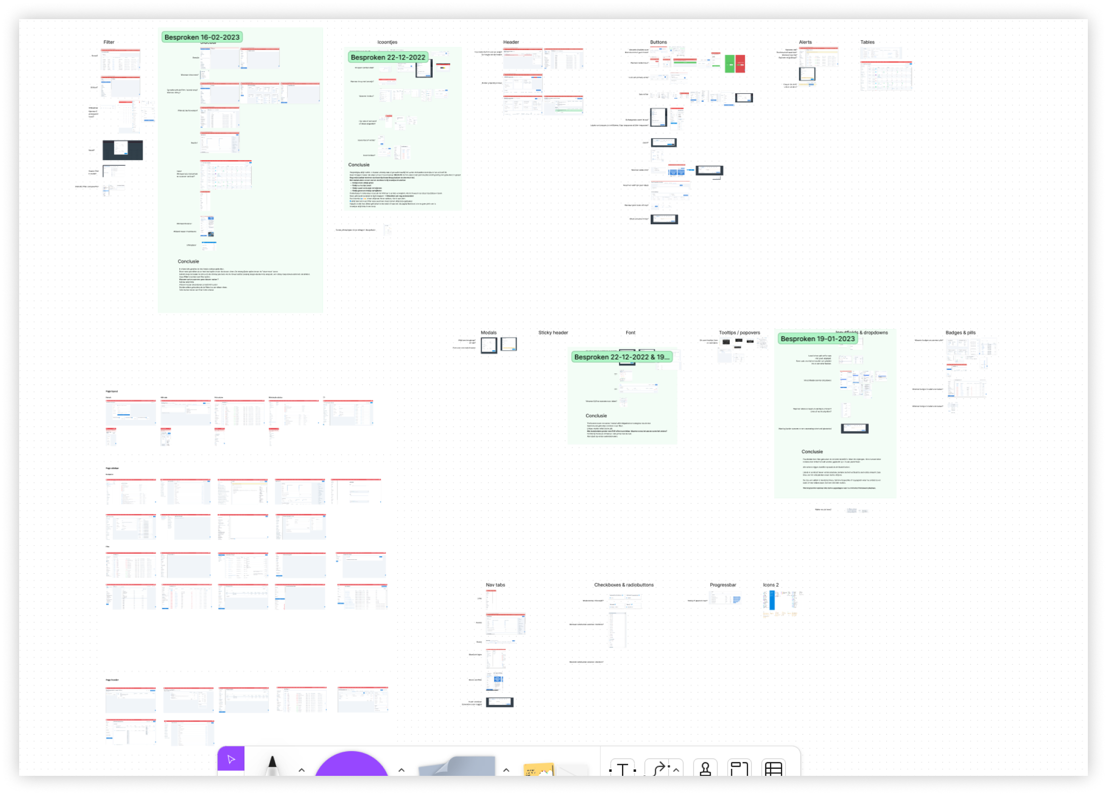
To achieve consistency across the entire system, it's essential to establish good design guidelines. These guidelines will serve as the foundation for designers to build new pages and functionalities.
I used the list from the beginning of the project which included all the elements, patterns and inconsistencies. I then scheduled regular meetings with front-end developers and UX designers to look at each section together. Discussing future choices and deciding which patterns and elements we were going to get rid of.
I noticed that the meetings were quite long because there was a lot to discuss. To make them more efficient, I did research on the functionalities of the elements and patterns before the meetings, to provide a clearer story on the advantages of certain choices. This led to shorter, more efficient meetings, which everyone, especially the front-end developers, greatly appreciated.
I then wrote out the guidelines and placed them in the backoffice where everyone had access to them. I then linked these guidelines to the front-end framework for components and the Figma library.
 Design guidelines I wrote for future usage of the button component
The design system is an endless project where new elements are constantly being added.
In order to keep an overview of these elements, new ideas are discussed with the entire design team before they are implemented. This collaboration also provides more extensive input on design choices, which increases the quality of new elements and patterns.
This also makes it possible to look at the reusability of new elements and based on that determine their priority or make adjustments to the element.
The design system has ultimately resulted in several benefits.
Firstly, the time from prototype to implementation has been significantly reduced. The component library and design guidelines provide designers with the ability to quickly build and test multiple prototypes. Tweaking prototypes using universal components also made this process a lot smoother.
Secondly, the design patterns for each project are now consistent with each other, resulting in a more cohesive system. This ensures that users can more easily understand new additions to the system, leading to fewer frustration. Additionally, it is now easier for designers to inform stakeholders of design choices with well-reasoned arguments.
And lastly, the design system has improved collaboration between designers by enabling decisions to be made more easily, using the guidelines we created ourselves as a basis for our designs.