 A few screens from the current order picking system
The order picking system utilized in both the warehouse and
stores undergoes frequent usage by multiple people on a
daily basis. Regrettably, the current system is antiquated
and fails to offer a user-friendly experience, leading to an
increased likelihood of errors and user frustration.
Our
objective is to locate the pain points that contribute to
these issues and collaborate with end-users to create
effective solutions. By enhancing the overall user
experience and streamlining workflows, we aim to boost
productivity and optimize time management within the
workspace.
A few screens from the current order picking system
Before working on a solution I took a close look at the
system and spent a day working alongside the warehouse staff,
to get a better understanding of how the system works in
practice.
After this I set the scope for the project. The goal would be reducing picking mistakes of placing the items
in the wrong bin.
I came up with a few ideas for improving the system. To test these ideas I started out creating a few wireframes and rough designs showcasing possible solutions. Then I went to the warehouse to validate the design by showcasing it to floor managers and walking a couple of users through the wireframes.
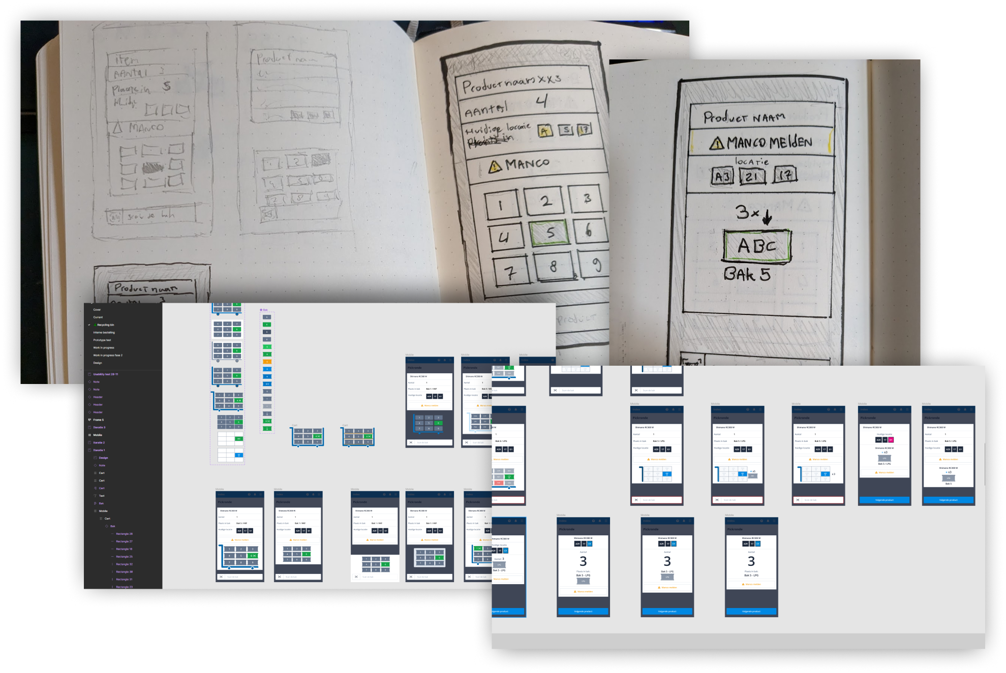 Wireframes of my proposed new design
During the testing process it became apparent that the proposed solution would only address one of the issues. More specifically the challenge of finding the correct bin for placing the product. However, a more significant problem that surfaced was the frequency of errors made when selecting the correct quantity of an item.
Despite being initially beyond the project's scope, I collaborated with the product owner and stakeholders to expand the project and tackle multiple issues simultaneously.
To accomplish this, I thoroughly mapped out the entire picking system and created a user flow that covered all possible paths. This gave a good insight of how the system worked and where improvements could be made.
 User flow of current system and my proposed user flow
I analyzed the user flow combined with my experience in the warehouse to identify what’s working and what’s not, on an interaction and usability standpoint, based on design heuristics.
The main issues I encountered:
Next I created a new design that incorporated new elements
based on an optimized user flow. I enlarged the elements
that were frequently misunderstood, and removed elements that
users deemed unnecessary. There was a lot of discussion
around whether it was necessary to show the next location,
given that the route should be optimized to direct users to
their current location.
However, it turned out that power users often started
walking towards the next location if it was closer to them. Realistically this wouldn’t
significantly improve the picking time, but it gave users a
sense of freedom, which they appreciated.
I then consolidated all the different screens into a single
screen. Ensuring that all elements remained in the same
location and users did not have to keep searching for the
information they needed.
 New one-screen interface
I tested this design with the stakeholders and gathered
feedback. Then I incorporated these elements into a
prototype and conducted a usability test with the users. The
findings from this research were interesting; some elements
were less important than the stakeholders believed, while
other elements were more critical, but for different reasons
than I had originally anticipated.
During testing a clock was introduced so that users could
see when they had a break. However after extensive
questioning of users, it turned out that they didn't want a
clock to see when they had a break, but they rather wanted
to see how fast their lap times were. Therefore there was no
need for a clock at all. Some users even reacted negatively
when asked if they wanted to use the clock to see when they
would have a break.
As a result I removed the clock from the design and
introduced a statistics page after each picking round. After
testing it was also decided to not only show the picking
round time, but also the user's speed record and average
picking round time. Users like to improve but do
not want to compare themselves with others. The design received positive feedback
during the usability test.
 Design of the new system with component library
Because the project became much larger than anticipated, it
was decided with the stakeholders to break it down into
phases. This way we could already roll out the most important
elements, and establish a solid framework for the rest of the
changes.
The goal of phase 1 was to set a strong framework that would
incorporate all basic and important actions. This was both
to prevent bugs from adding too much too quickly, and to
introduce the users to the new system without causing
information overload.
Phase 2 was a combination of important elements that were
more time-consuming for the programmers to incorporate in
phase 1, and improvements gathered from user feedback.
A big challenge was making the interface work for every type of order picking. Every type has it's own elements that would have to fit on the screen, which would be hidden when not present in that chosen system. But after cracking this puzzle it was still possible to make one screen to rule them all, without losing functionality.
We quickly received the results of the new design. The floor manager reported a noticeable decrease in picking errors, and users responded positively to the new interface.